
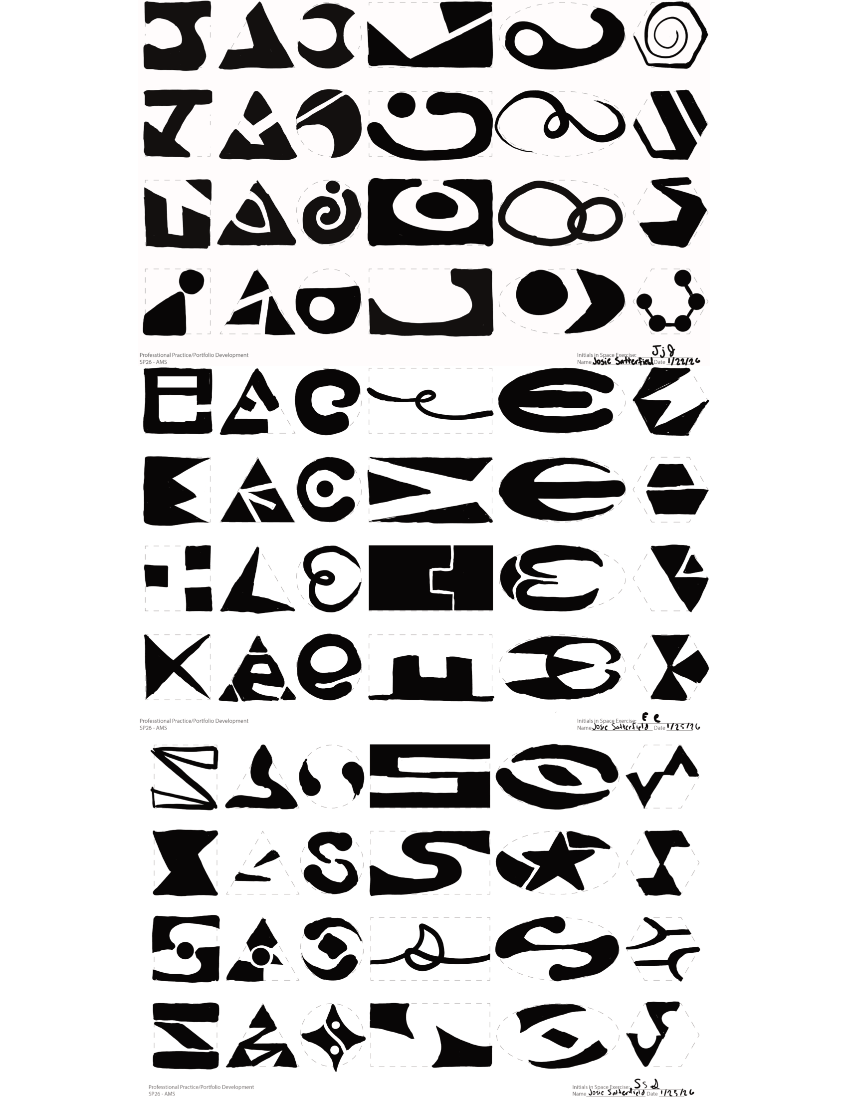
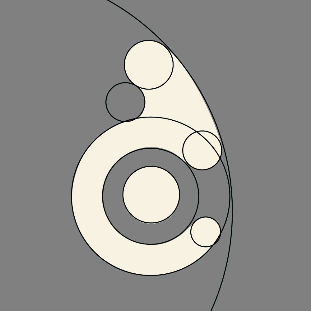
Sketching exploration of positive and negative shapes coming together to form my initials, JES.
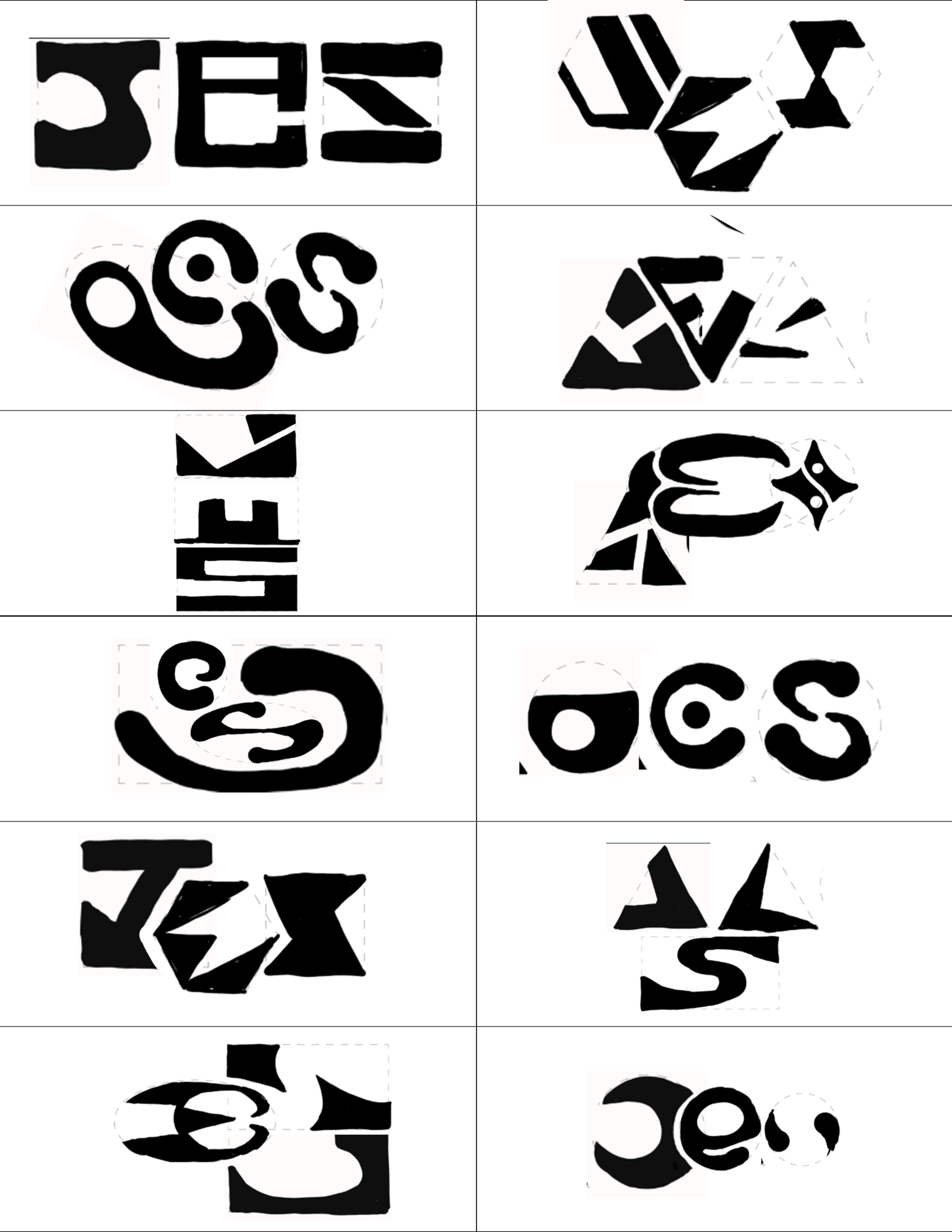
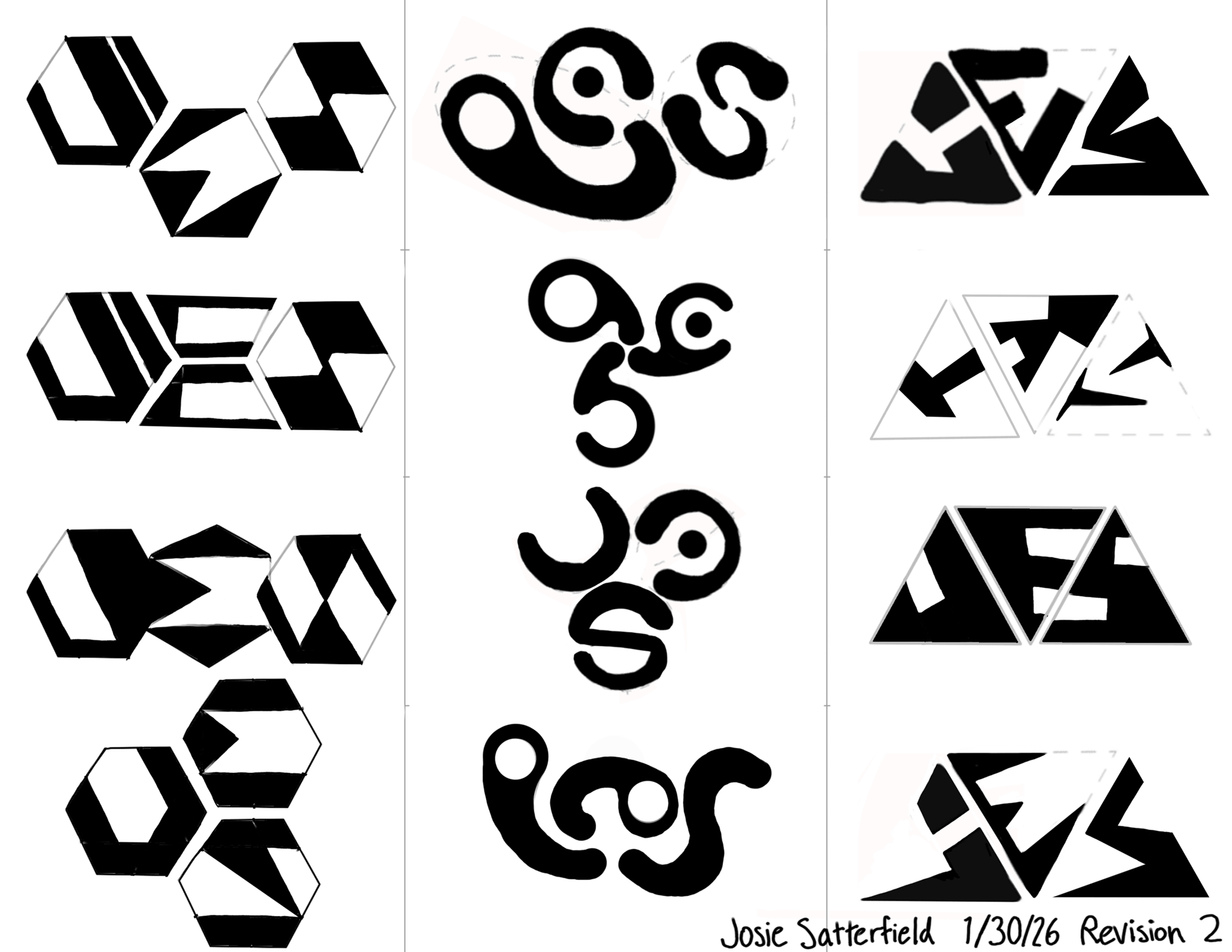
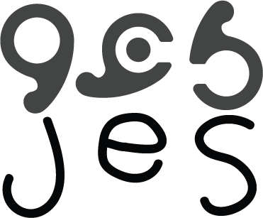
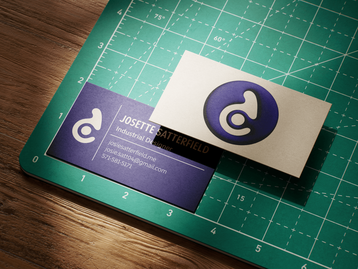
The final design direction subtly references my initials while avoiding a literal letterform solution, creating a more memorable and creative identity.
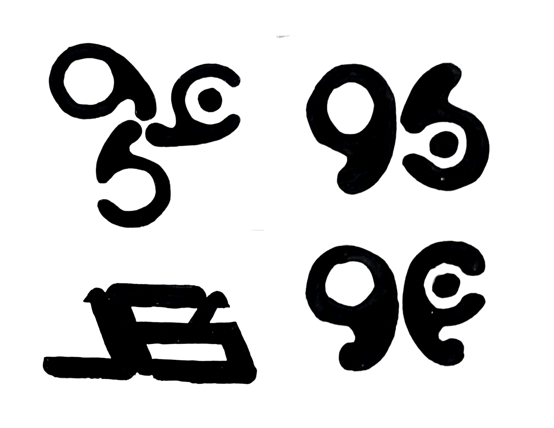
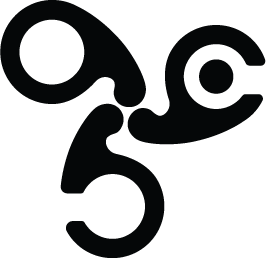
Ultimately, I combined features from all three shapes into one form to become my final logo.
My design practice is hands-on, exploratory, and material-driven. I often think through making, whether sculpting clay, painting, sewing, or prototyping physical objects.
I wanted my personal identity to reflect that same tactile process. The final logo uses freeform curves and soft contours that feel shaped by hand rather than mechanically constructed.
The final brand identity uses the colors Orient Blue and Cream. Orient Blue is the color represented by my birthday in the book Colorstrology: What Your Birthday Color Says about You.
This shade of blue has followed me lately. At the time of this project, my dyed blue hair had faded to a very similar shade of indigo. I ultimately felt that this was the perfect calming yet creative color to represent me.